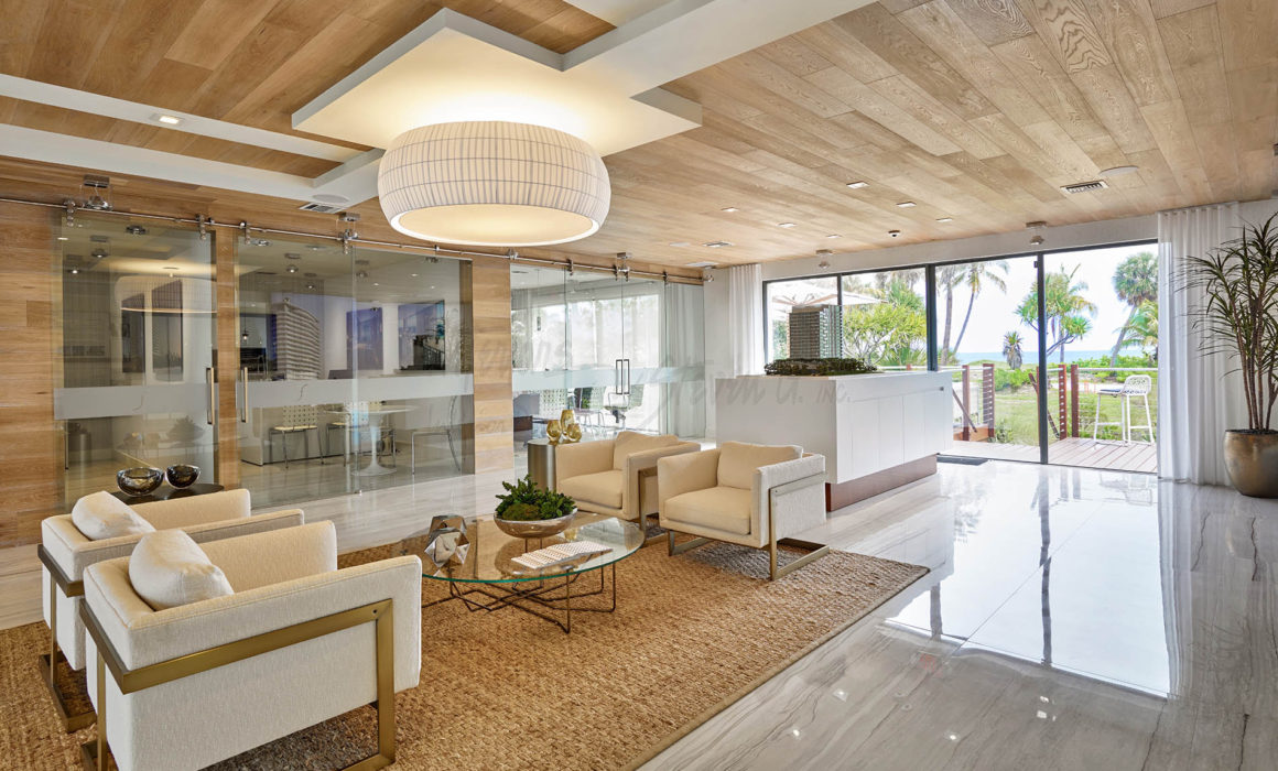
Color psychology plays a vital role in commercial interior design, as it has the power to shape the environment and influence the mood and behavior of customers and employees. The selection of colors in a commercial space can have a significant impact on the overall branding, atmosphere, and functionality of the space. Understanding the psychology of color is crucial for designers looking to create spaces that not only look visually appealing but also evoke the desired emotions and responses from those who interact with the space.
When it comes to commercial interior design, different colors can evoke different emotions and convey different messages. For example, blue is often associated with trust, reliability, and professionalism, making it a popular choice for corporate offices and financial institutions. On the other hand, red is known to stimulate appetite and create a sense of urgency, which is why it is commonly used in restaurants and retail spaces to attract customers and encourage purchases. Yellow is associated with optimism and creativity, making it a good choice for spaces that foster innovation and collaboration, such as creative agencies and coworking spaces.
In addition to influencing emotions and behavior, colors can also affect the perceived size and functionality of a space. Light colors such as white and pastels can make a space feel larger and more airy, while dark colors such as navy blue and charcoal can create a sense of intimacy and coziness. By strategically using colors in a commercial interior design, designers can manipulate the perception of space and create different atmospheres depending on the desired outcome.
Furthermore, the color scheme of a commercial space should align with the brand identity and target demographic of the business. For example, a luxury brand may opt for a more sophisticated and elegant color palette, such as gold, silver, and deep purples, to convey a sense of exclusivity and luxury. In contrast, a youthful and vibrant brand targeting millennials may choose bold and energetic colors like neon green and electric blue to appeal to their target audience.
It is also important to consider cultural associations and preferences when selecting colors for commercial interior design. Different cultures have varying interpretations of colors, and what may be seen as positive and uplifting in one culture may be perceived as negative or inappropriate in another. By conducting thorough research on the target market and understanding the cultural significance of colors, designers can ensure that the color scheme of a commercial space resonates with the intended audience and conveys the desired message.
In addition to the aesthetic and emotional aspects of color psychology, colors can also have a physiological impact on individuals. For example, studies have shown that exposure to certain colors can affect heart rate, blood pressure, and even appetite. By incorporating calming colors like soft blues and greens in a healthcare setting, designers can help create a soothing and healing environment for patients. Similarly, using energizing colors like red and orange in a gym or fitness center can boost motivation and performance during workouts.
Overall, color psychology is a powerful tool in commercial interior design that can be used to enhance the functionality, atmosphere, and brand identity of a space. By understanding the psychological and physiological effects of colors, designers can create spaces that not only look visually appealing but also foster the desired emotions and behaviors in those who use the space. Whether it's creating a calming environment in a spa, stimulating appetite in a restaurant, or promoting productivity in an office, the strategic use of colors can have a profound impact on the success of a commercial space.